School of Interactive Arts & Technology
Type Design
Brand Identity
Team
Personal Project
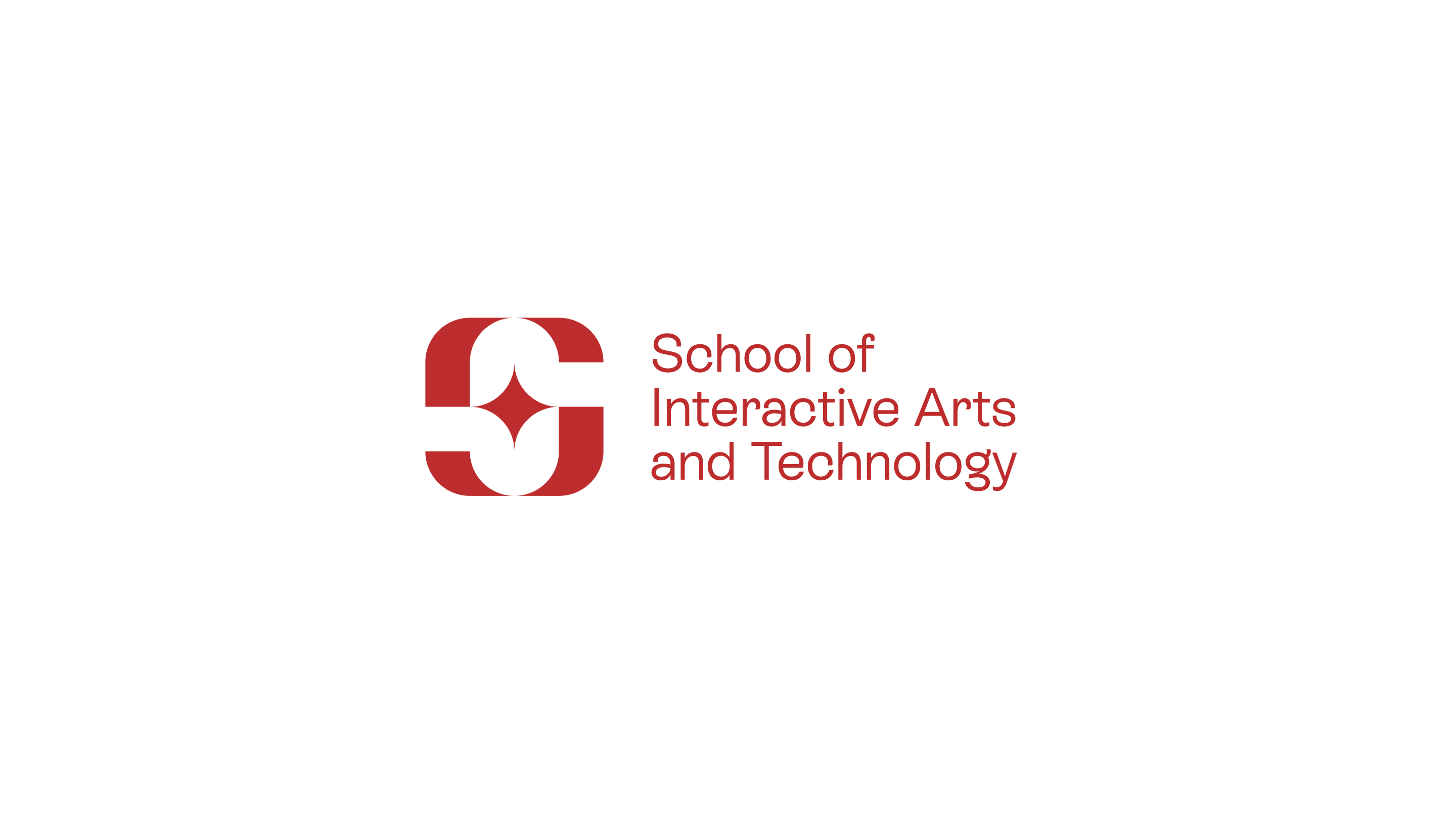
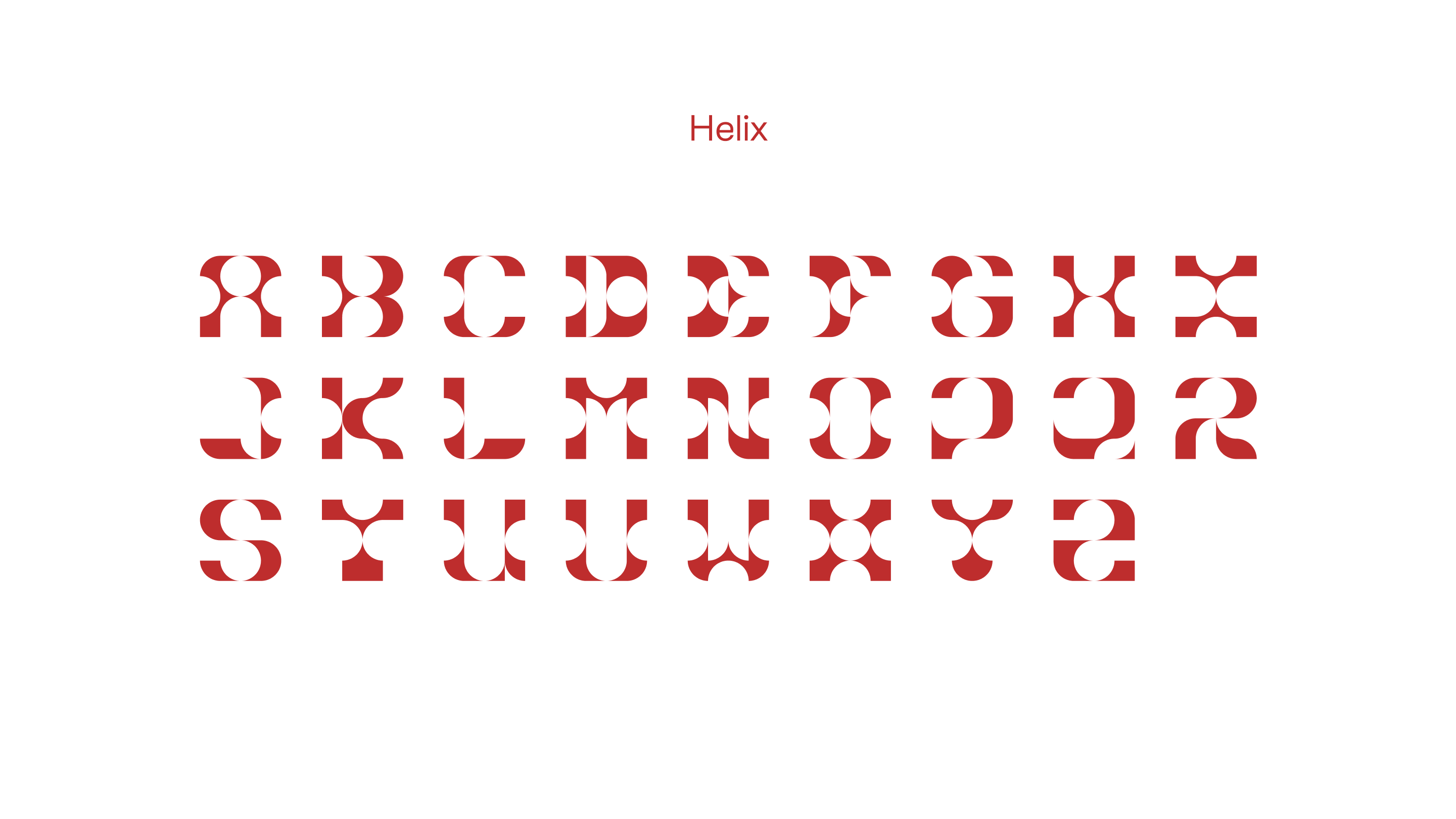
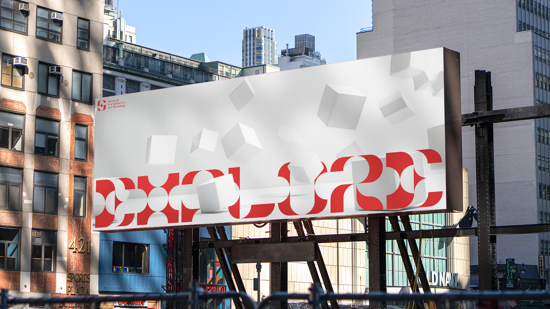
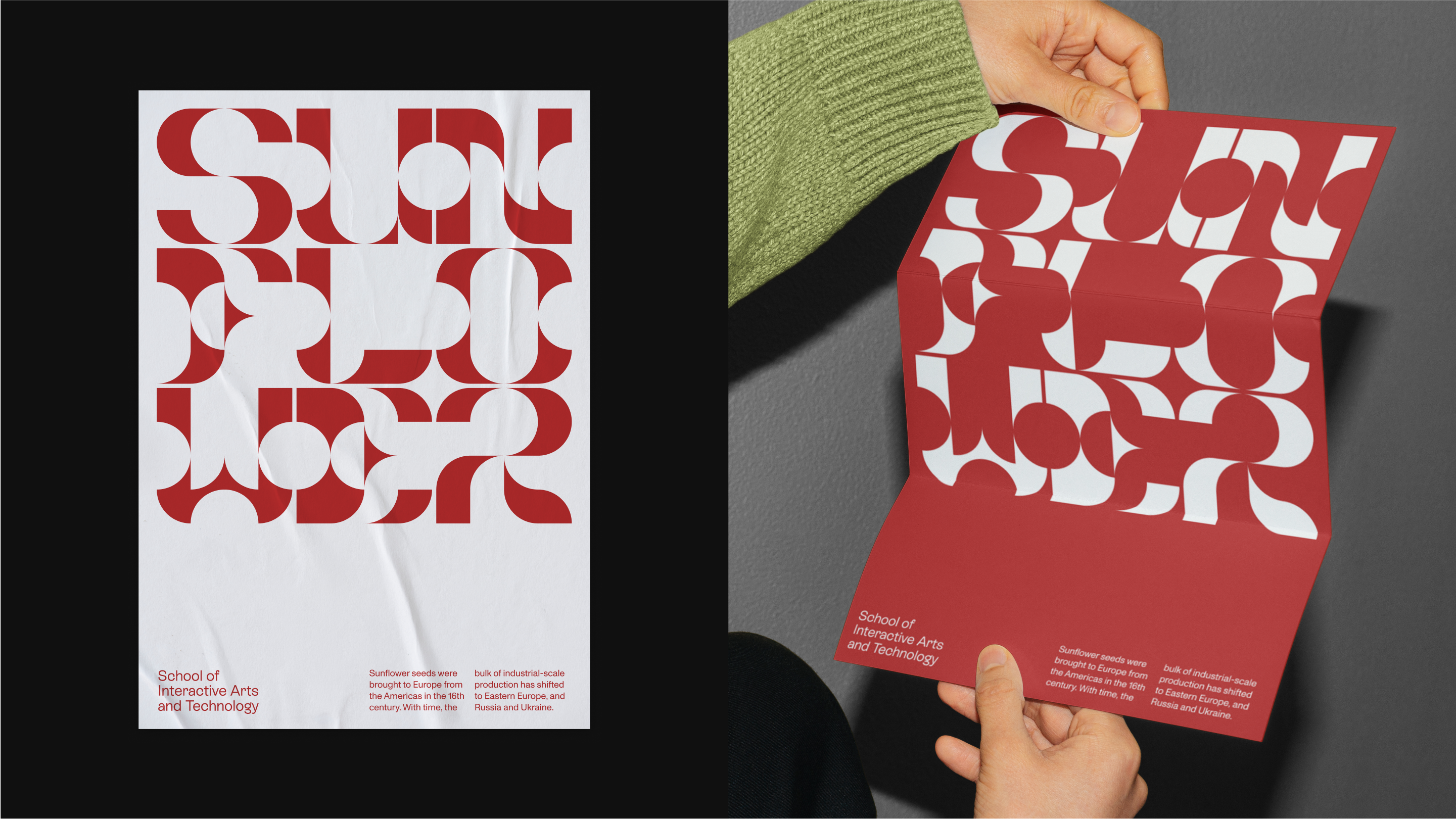
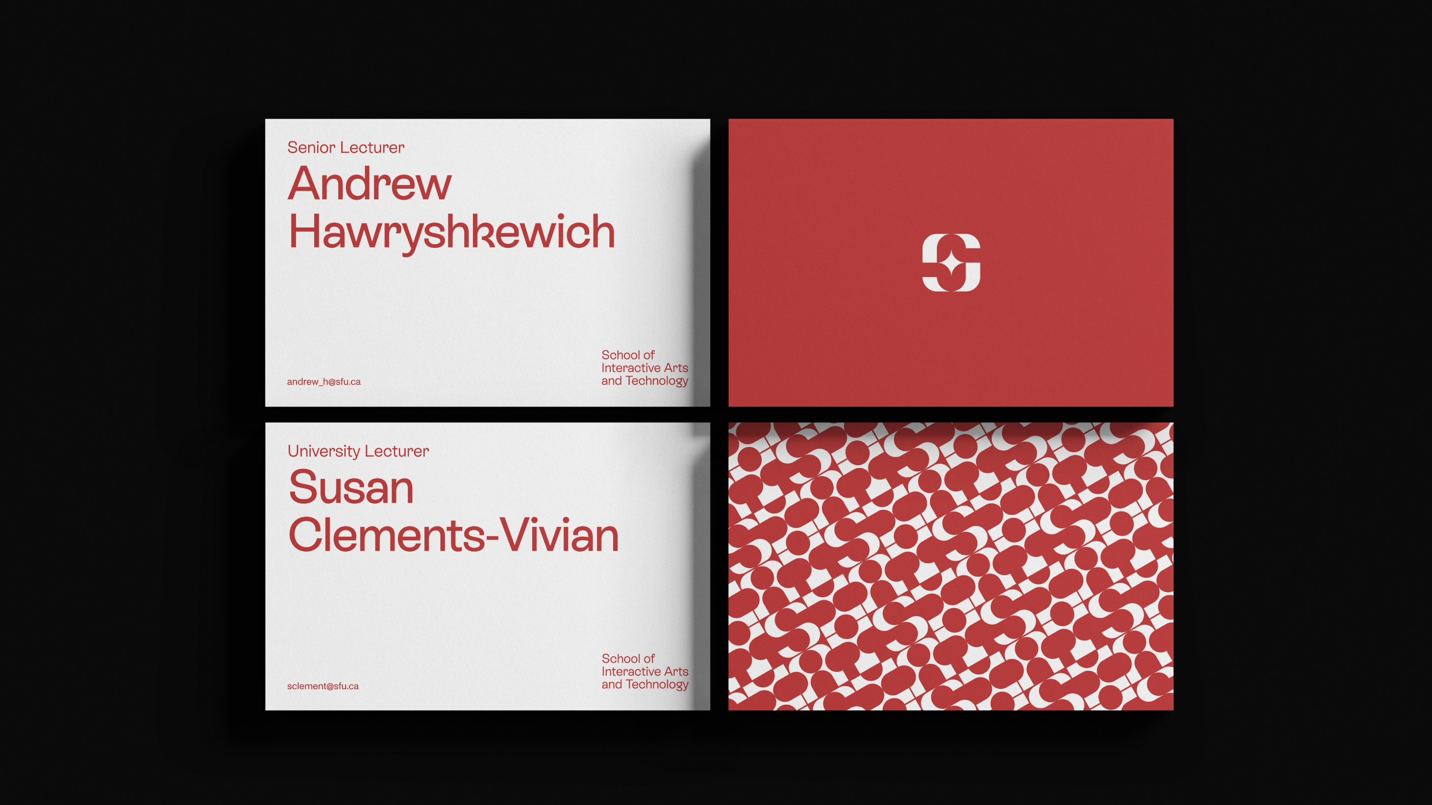
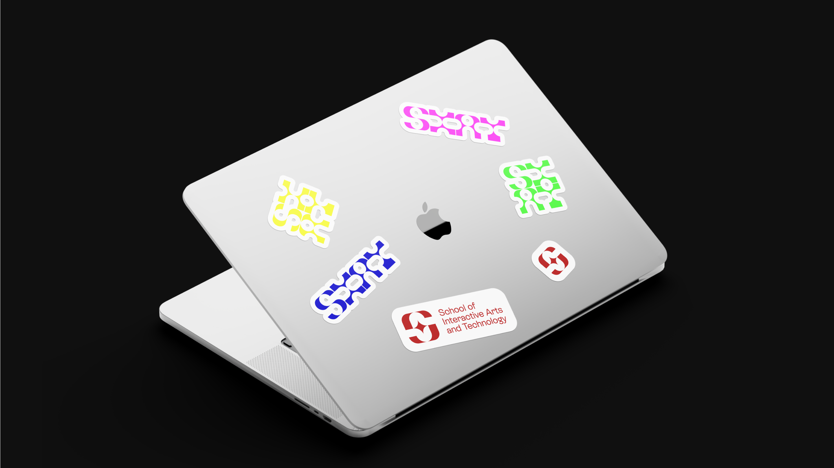
A rebrand of the School of Interactive Arts and Technology (SIAT) that encourages students to explore the intersection between art and technology. Helix, a custom display typeface, uses a converging motif throughout the type’s form representing graceful points of intersection. At the heart of SIAT lies its vibrant and diverse community that is instilled with excellence. Student mastery is celebrated through adaptive and contrasting colours that is meant to compliment and showcase student work.
Week 1 - 4
Business Problem
SIAT's extensive art and technology based practices, ranging from filmmaking to 3D modelling, diminishes their resources to deliver focused curriculums. This lack of focus leads to the confusion of prospective students as they seek the security of an established education path.

Week 3 - 11
Typographic Approach
With the rebrand of SIAT, the visual solution I propose consists of Helix, a custom display typeface, that uses a converging motif to represent SIAT as the intersection between art and technology. It's supporting typeface follow a neutral, but elegant feel to uphold its integrity as an educational institute, while also being approachable through its calligraphic roots.
Week 3 - 11
Colour Approach
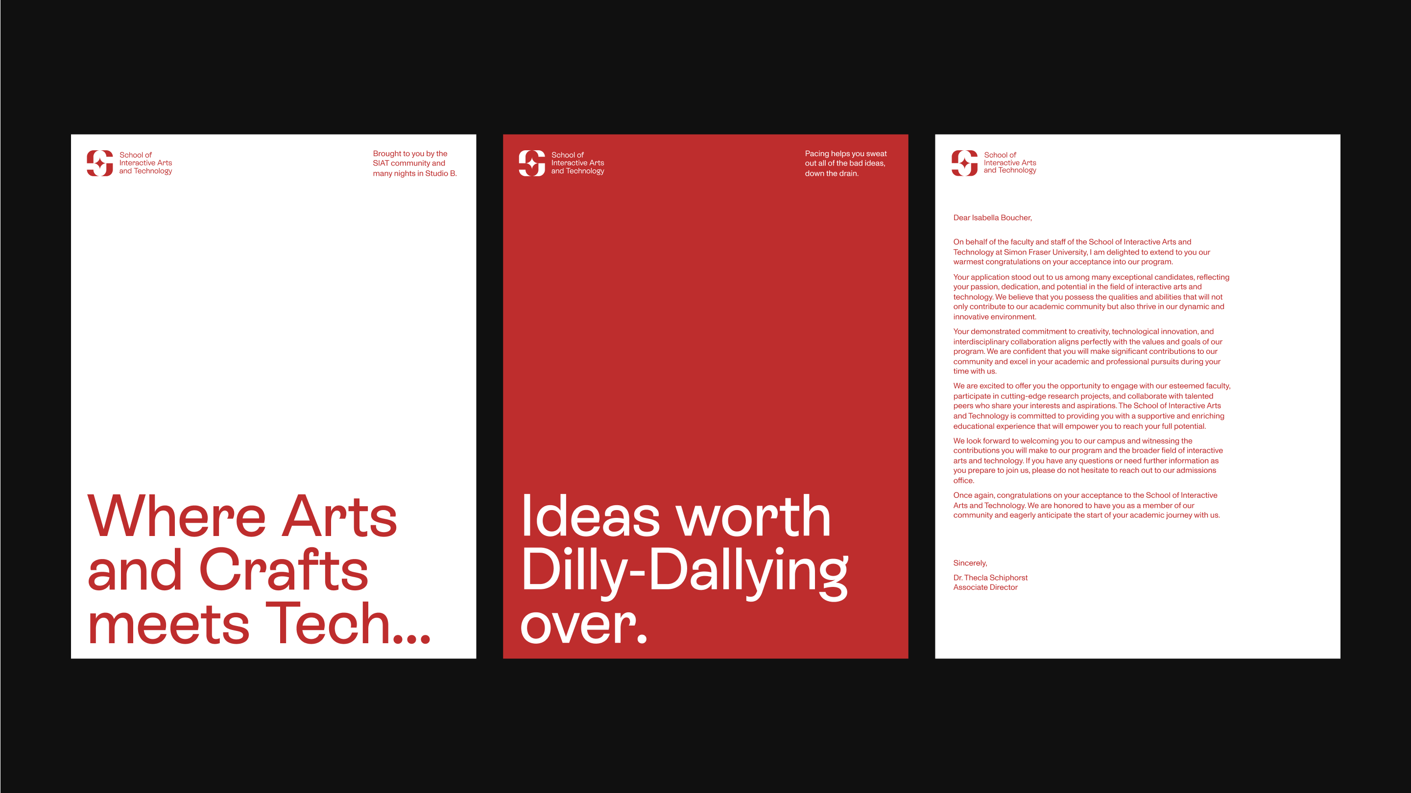
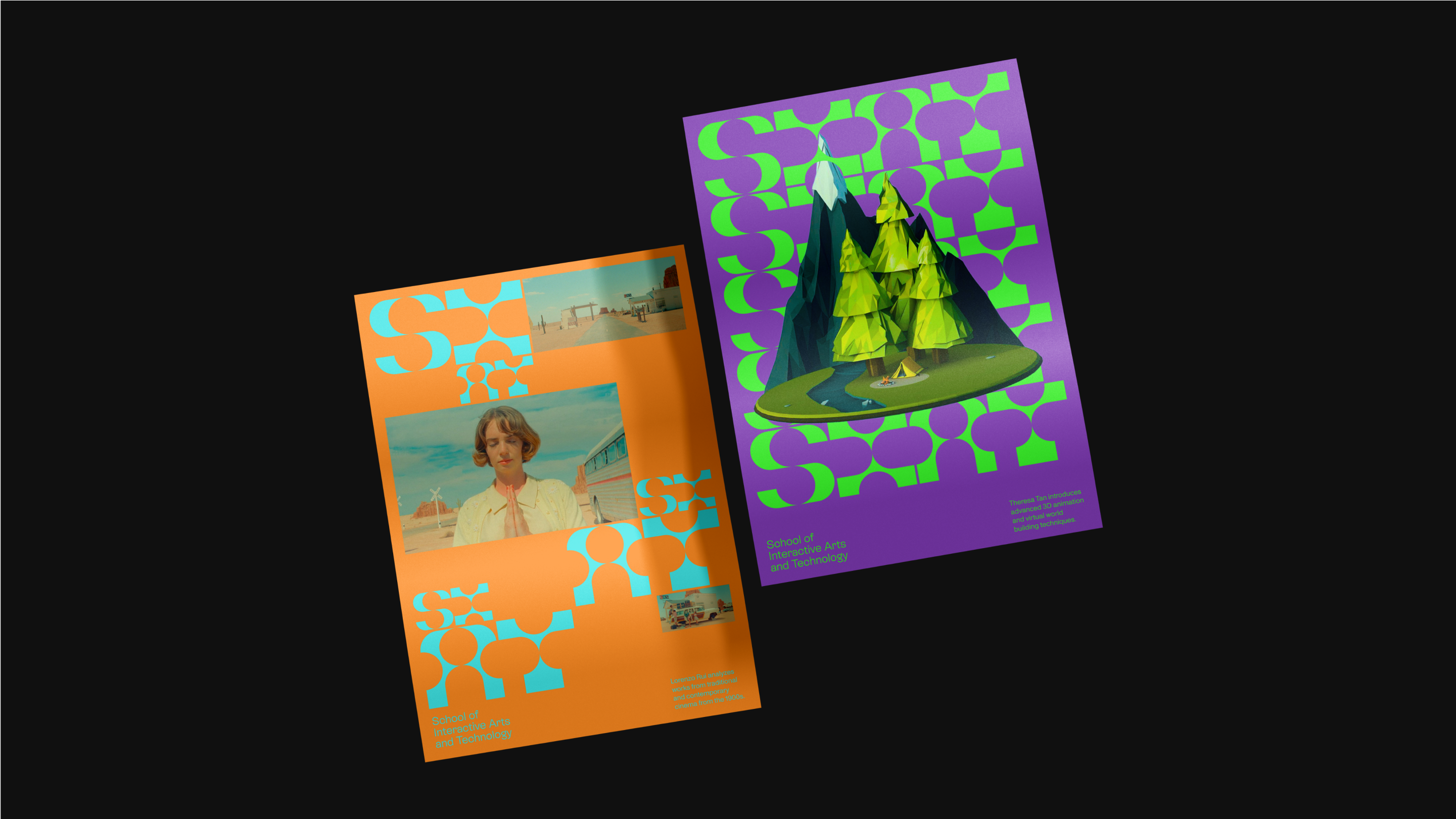
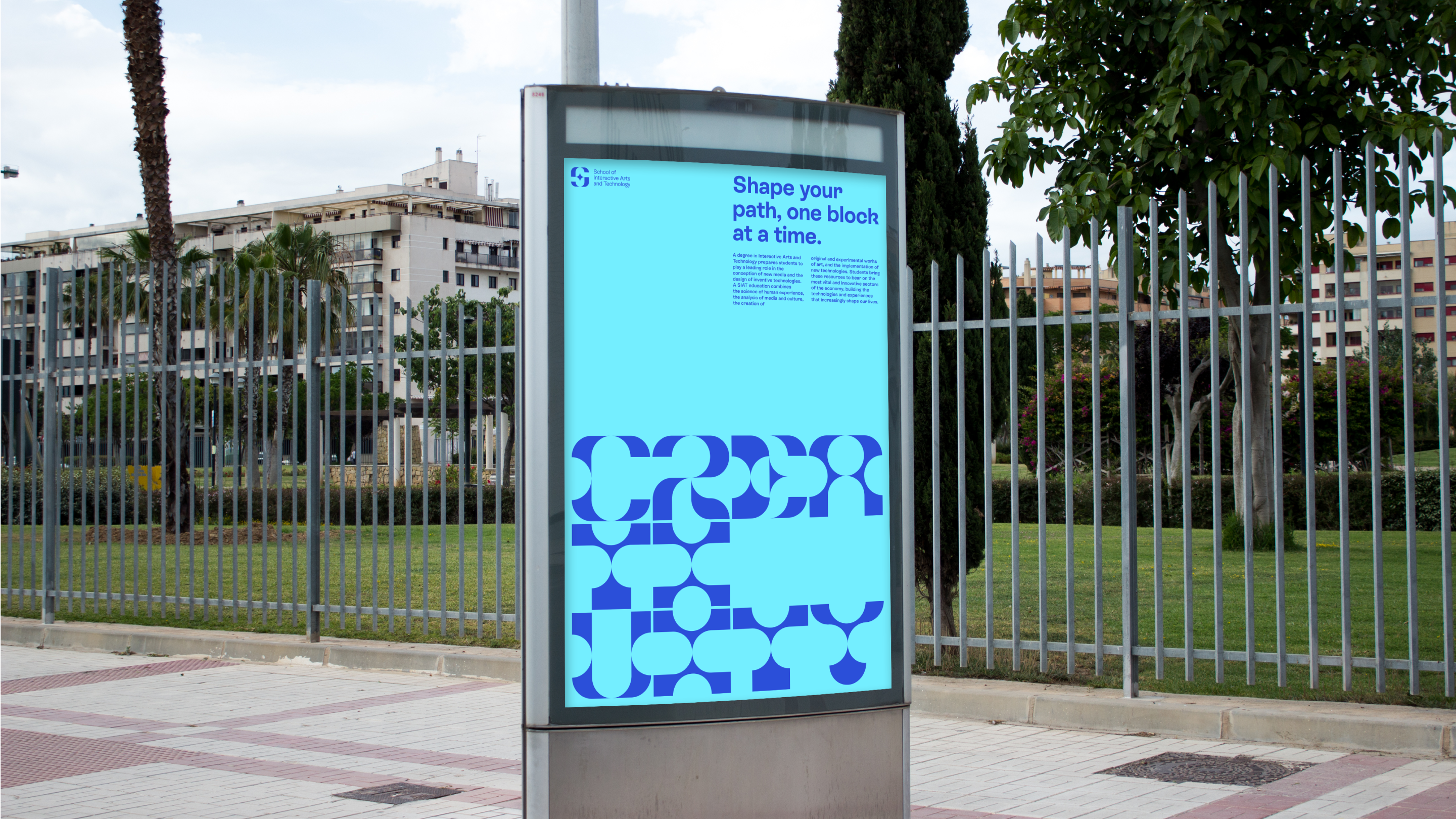
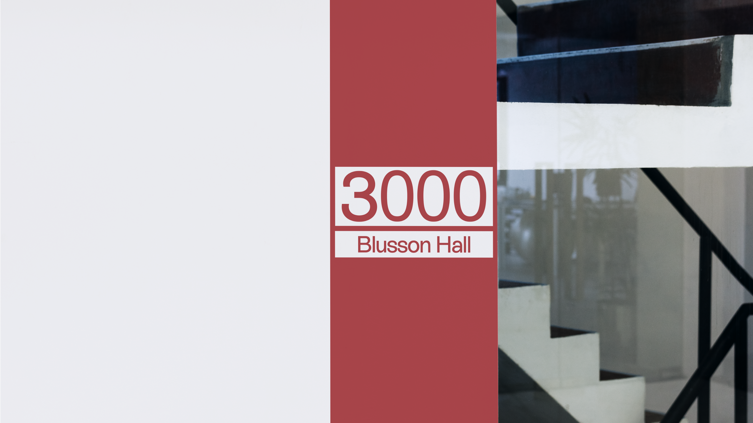
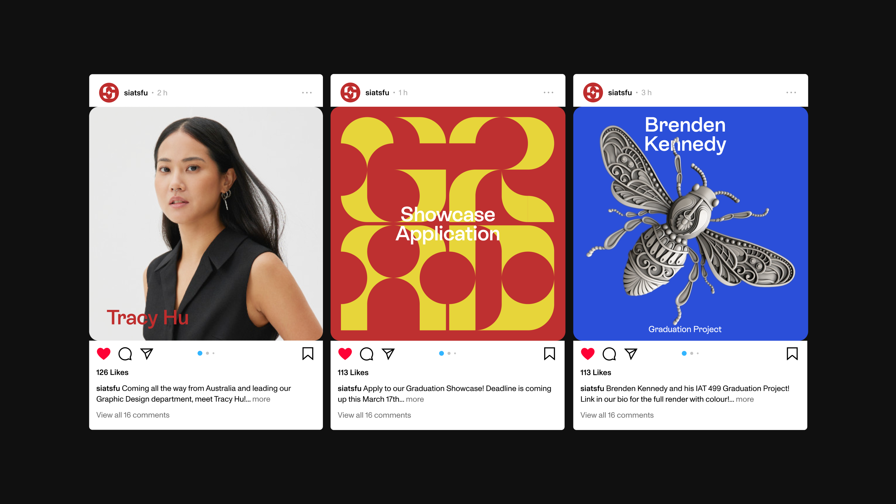
The colour approach was used strategically to compliment and showcase the mastery of student's in the program. The vibrancy and contrast of colours exude the diverse and opinionated students of SIAT.

Week 12
Reflection
Typefaces having been one of my first loves, I was excited to create my own. Understanding proportions and the density of type was a challenge that I enjoyed tinkering with even though the end result wasn't perfect. That coupled with running around, guerrilla style, to interview SIAT students about how they viewed the school was an interesting experience. However, when it came down to synthesizing the themes that I had gathered, it was a struggle to convert these abstract ideas such as "exploration" and "intersection" into a visual form. All in all, I'm proud of the work I've done as this is something I never thought I would do!
