World Chess Federation
Brand Identity
Team
Personal Project
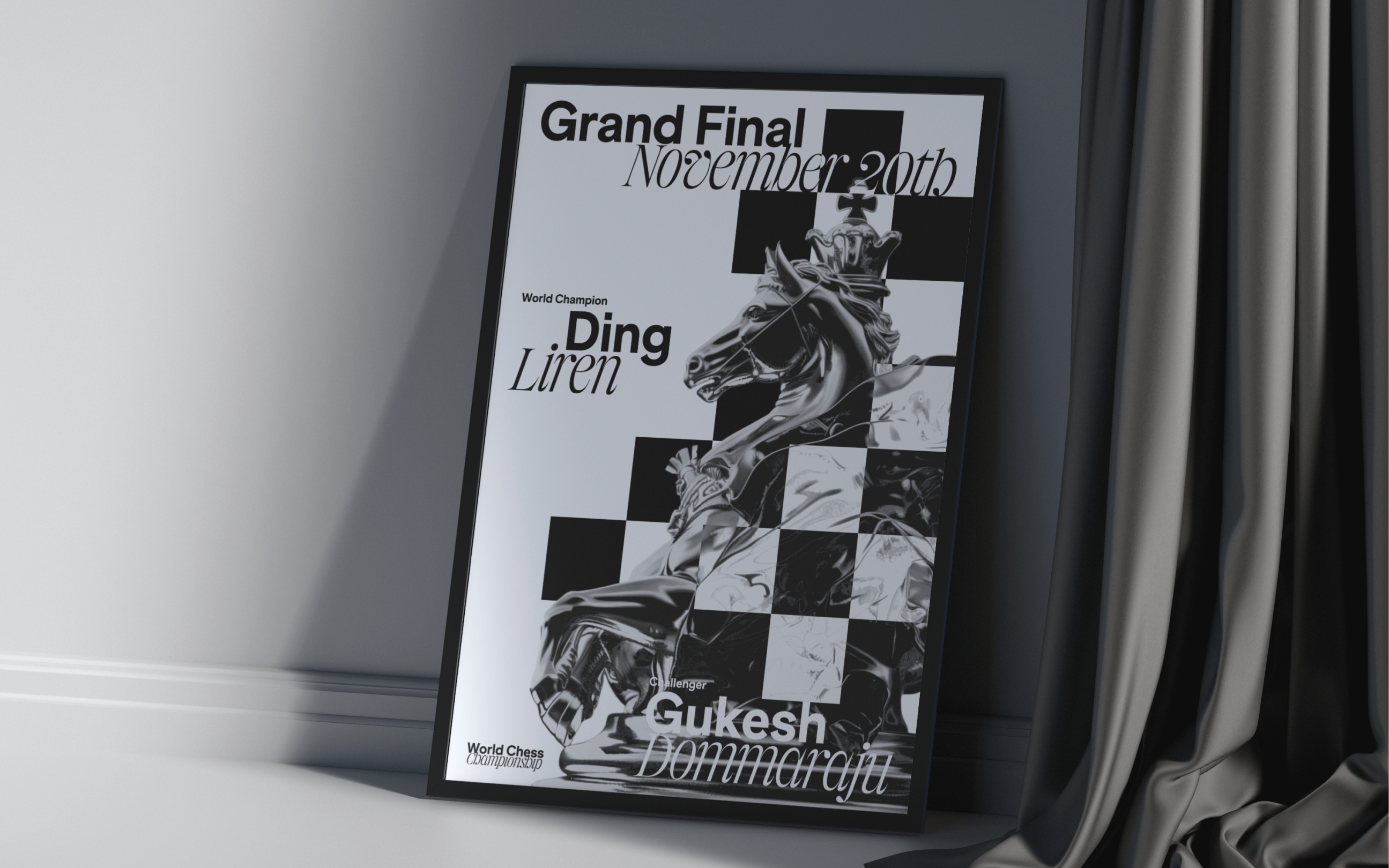
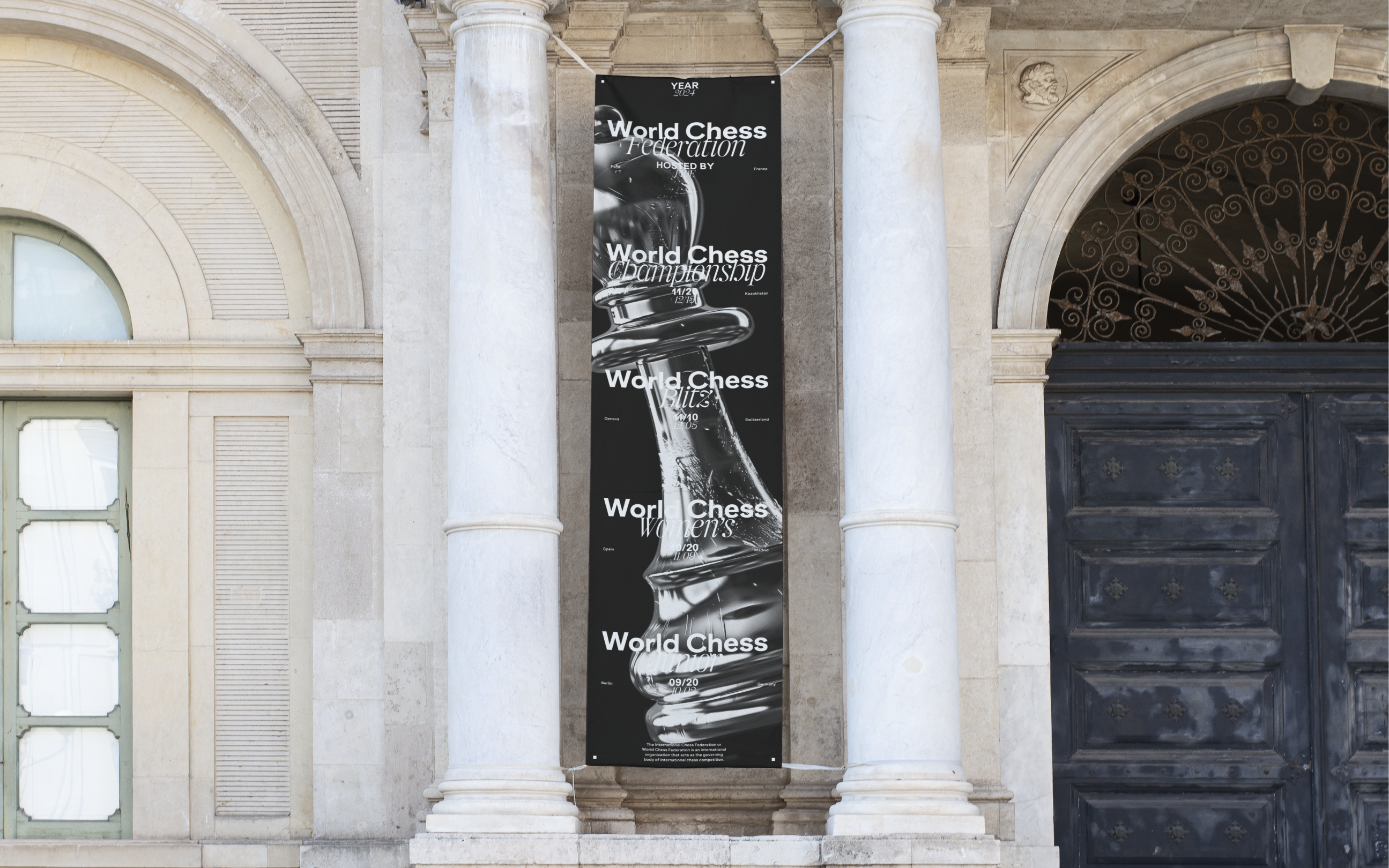
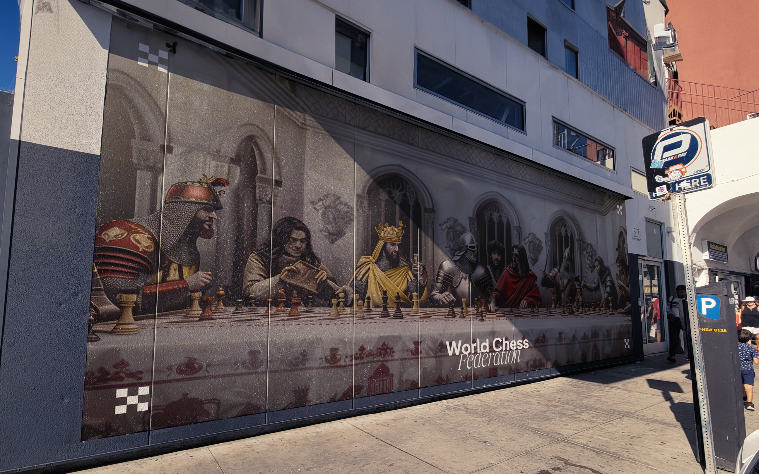
Chess is a game of duality. At its core stands the idea of slow, methodical, and strategic play, contrasted with the dynamic board states and the strong competitive spirit while playing the game. The inspiration for the dynamism and rationality was found within the Baroque era to evoke the spirit of playing the game of Chess. Visually, this includes the flowing ornamental flourishes found in the architecture and the more technical materials used such as silver. This creates a harmonious tension within the visual identity encapsulating the sport of Chess.
Week 1 - 3
Business Problem
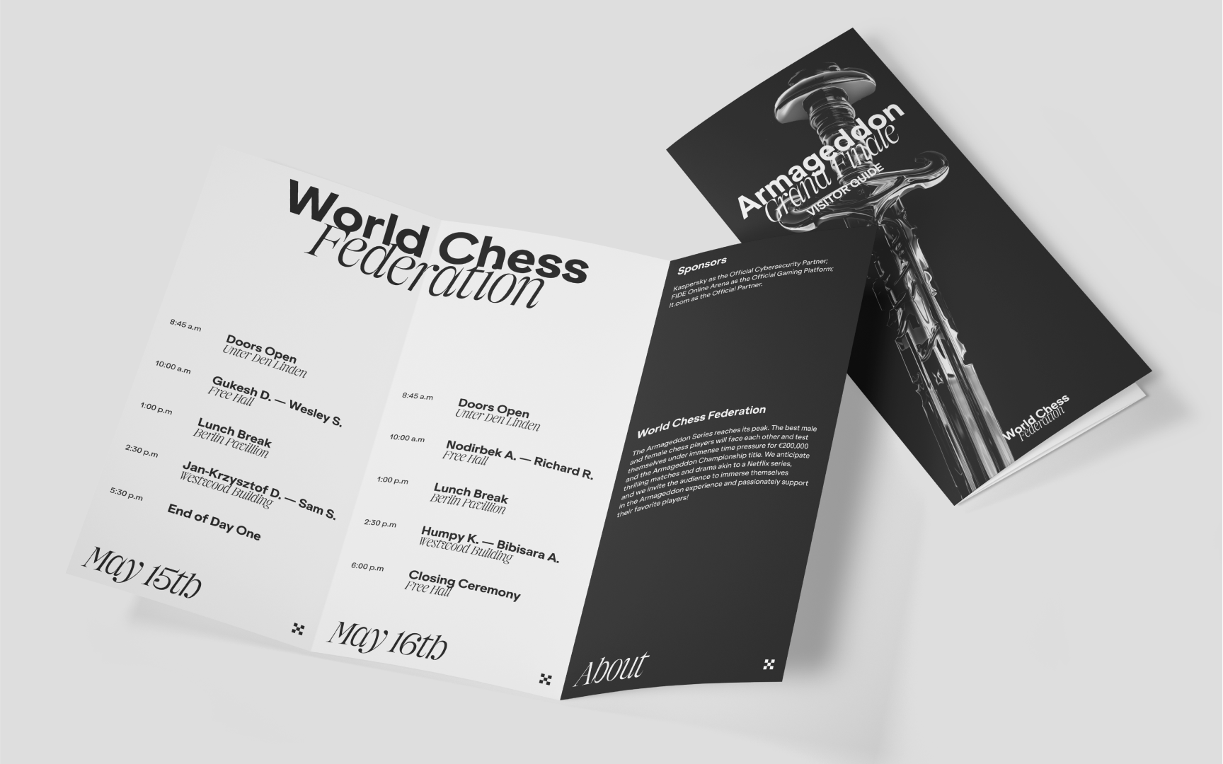
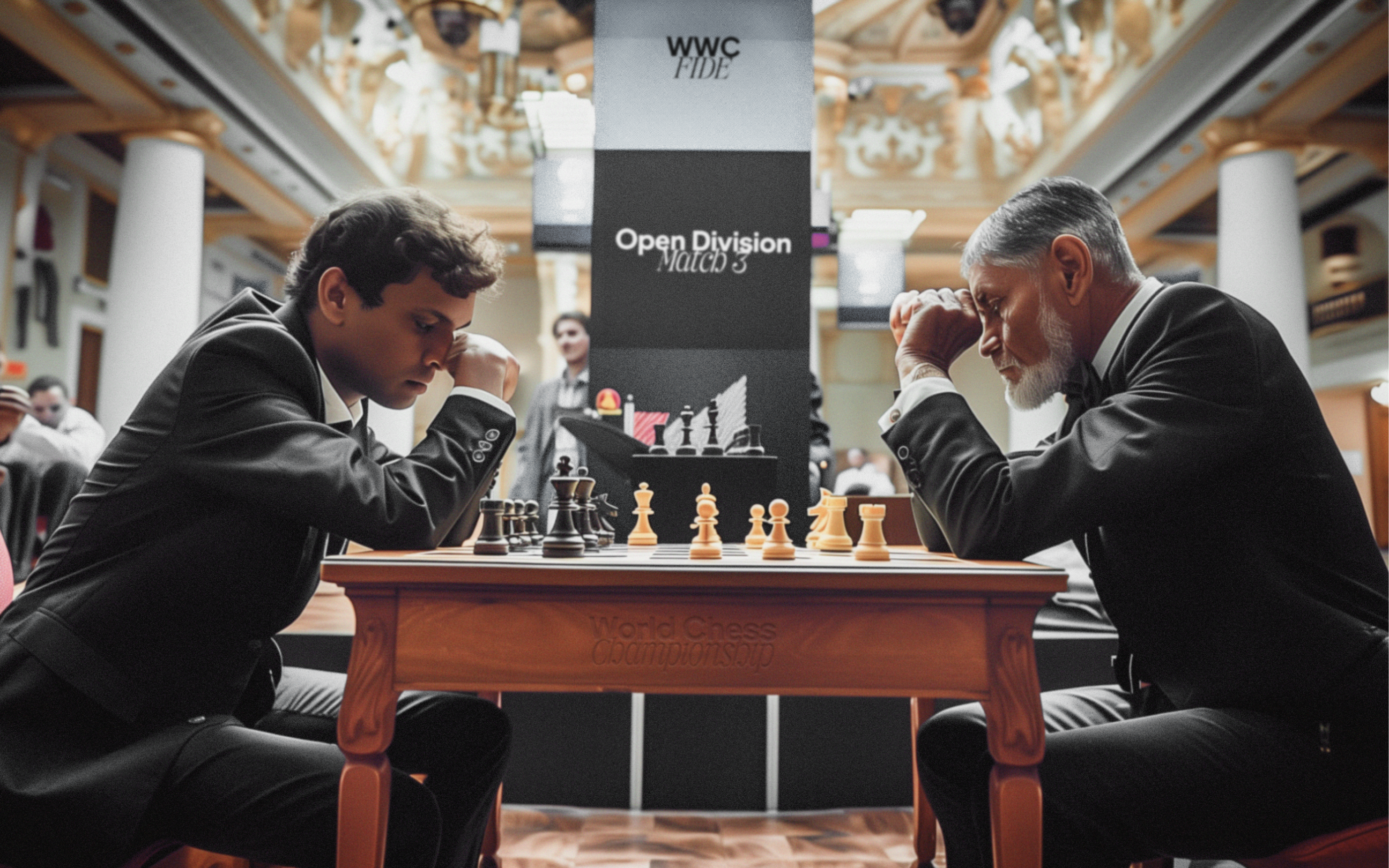
The World Chess Federation (WCF), is the international governing body of Chess. While conducting research, players voiced their frustration as to why there had to be multiple websites and touch points to keep up with recent Chess news, standings, and tournament updates that had variants of the same brand identity, causing confusion within their player base.
Week 4 - 5
Proposed Intervention
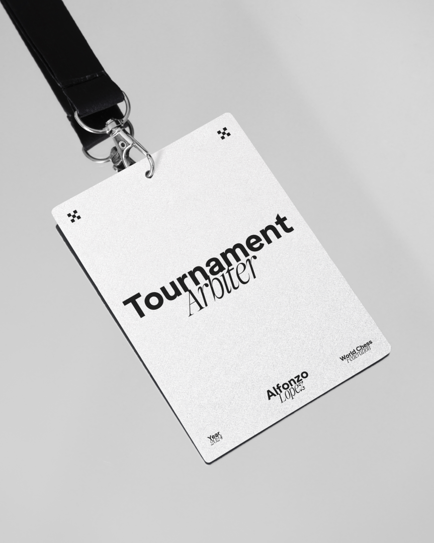
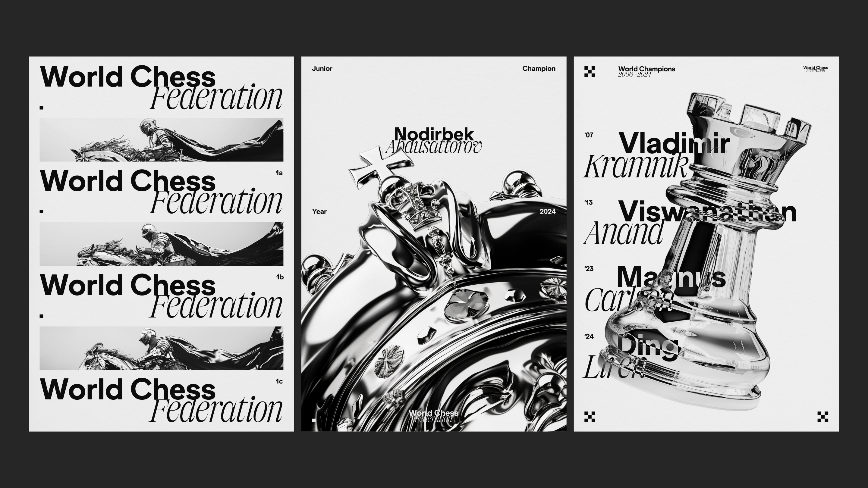
My proposed solution is to restructure the WCF's sub brands to align it with customer expectations of having a central touch point for all of their content needs which ensures consistency in brand messaging and customer experience, fostering trust and reliability. This was done through a clear typographic logotype system and brand guidelines that respect the history of Chess and reinforces the spirit of play.

Week 6 - 11
Typographic Approach
To honour the duality of the WCF – its tension between dynamism and rationality – a pair of harmonious typefaces were chosen that reflect the traditional values and history of Chess with a contemporary twist. ES Klarheit was chosen due to its sharp, angular and systematic approach to type, while OT Miniature is a display typeface that has beautiful flourishes inspired by the Baroque era of art. The italic variant of OT Miniature adds a detail of movement that sets it further apart to its counterpart.
Week 12
Reflection
My main takeaway from this project was the importance of understanding the intent behind any rebrand and to really sell the vision and value of it. My main challenge would have had to be finding an organization that would benefit from a rebrand in a strategic sense, aside from the aesthetics. This meant thinking about the customer experience and journey, and how the visual identity could help guide that process in a more intuitive way. Overall, this was an exciting side project as I got to intertwine my business and design perspectives (and less running around)!